What the Shelf Sees First: A Writer's Guide to the Book Spine
Photo: Sabine Baring-Gould, Public domain, via Wikimedia Commons
In a UK bookshop, most books are not met face-on. They are met edge-on: a row of coloured strips, each asking to be noticed before it is understood. For a personal growth book, the spine is the first ambassador. It speaks in a narrow column of type, often under poor light, while the reader is walking, carrying a bag, or scanning for a familiar name. The cover may close the sale later; the spine begins the conversation.
The Shelf as a Reading Environment
Face-out displays are generous but limited. The majority of stock in Waterstones, independent bookshops and public libraries is arranged spine-out. In the personal development section, memoirs, productivity guides, books on confidence, grief, habit and leadership sit shoulder to shoulder. The reader's eye moves quickly. A spine must be legible at a distance, distinct from its neighbours and honest about what the book offers. At home, the same object becomes part of a smaller landscape: the bedside shelf, the study, the kitchen table. A spine that works in a shop often works in a home because it rewards a second, slower look.
What the Spine Can Say Before Words
Colour is the first signal. Warm neutrals may suggest reflection; bright blocks may suggest energy or a practical programme. These are conventions, not rules, and they shift. The safer test is contrast: can the title be read in greyscale? Can it survive the shadow of a shelf above? A spine that relies on delicate pastel type against cream may look elegant in a design studio and disappear in a library aisle.
Thickness carries its own message. A slender volume may feel approachable, but it can also appear slight if the subject is substantial. A thick book may promise depth, yet it can also suggest a commitment the reader is not ready to make. Personal growth books often sit in the middle: long enough to be useful, short enough to be started. The spine's width also governs type size. Cramming a long subtitle into a narrow spine is a common error; the result is a strip of texture rather than a sentence.
Title wording matters most. The spine can hold very few words at reading speed. A title that is concrete and active tends to travel better than an abstract phrase that needs a subtitle to explain it. If the title cannot be understood without the subtitle, the spine is doing two jobs at once. That can work, but it must be designed deliberately: title large, subtitle smaller but still legible, with clear spacing between them.
Author name placement is a quiet signal of authority. An established author may sit at the top, where the eye expects a name it recognises. A new author may sit lower, nearer the title, so that the book's promise leads. Neither is universally right. What matters is consistency with the cover and a clear hierarchy. The reader should not have to work out which line is the title and which is the author.
Publisher marks complete the introduction. An imprint logo can reassure a reader who knows the list; an award badge can signal approval. But clutter is costly on a spine. Too many small marks compete with the title and make the book look uncertain about its own identity. The publisher's mark should be present, legible and subordinate to the book's name.
A Checklist for the Spine Proof
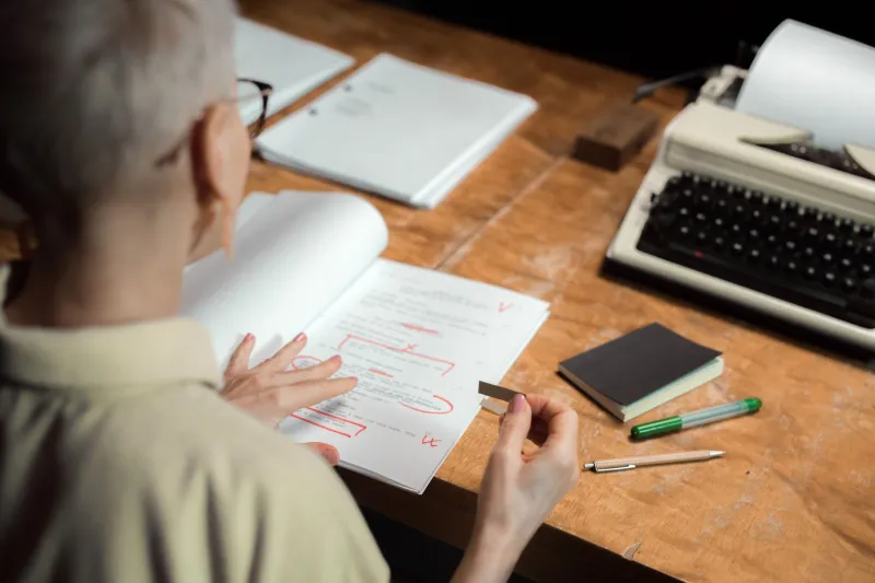
When the spine proof arrives, treat it as a reader would. The following checks are practical rather than technical:
- Place the proof on a shelf at eye level and view it from one metre, then two metres. Note what remains readable.
- Photograph it at arm's length among five neighbouring books. The camera is a useful approximation of a hurried glance.
- Read the title alone, without the subtitle. Does it make a clear promise?
- Read the subtitle alone. Is it a sentence or a slogan? If it is a slogan, does it earn its space?
- Convert the spine to greyscale. Check that the title does not vanish into the background.
- View it under warm and cool light. Bookshops and libraries rarely offer studio conditions.
- Confirm that the author name is spelled correctly and placed where the eye expects it.
- Check the publisher mark for size and clarity. Remove any mark that competes with the title.
- Look at the ISBN, barcode and any distributor label. Will they obscure type on the final copy?
- Ask a bookseller or librarian to glance at it and say what they think the book is about. Their first answer is the spine's real speech.
The Ethics of the Narrow Strip
A personal growth spine carries a promise, and promises should be proportionate. Words that suggest cure, guaranteed transformation or clinical expertise can attract a reader for the wrong reasons. The spine is not the place for a claim that the book cannot support. A clear title and a modest subtitle are more persuasive than a large claim in small type.
The spine is the smallest stage a book will ever occupy. It is also the one most readers will see first. Reviewing a spine proof is therefore an act of empathy: an attempt to stand in the aisle, at a distance, and hear what the book says before it is pulled from the shelf. A good spine does not shout. It speaks clearly, once, and invites the hand.